Dark mode has emerged as a prominent trend in UX design, revolutionising how interfaces are created and experienced by users. Also known as dark theme or dark UI, this design approach features dark backgrounds with light-coloured text and graphics, and has gained widespread popularity in various platforms such as web design, mobile apps, and software interfaces, offering a fresh and contemporary approach to UX design.
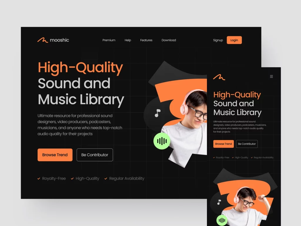
The Impact of Dark Mode on User Experience
The impact of dark mode on user experience has been significant. Let’s explore how dark mode design has influenced UX design:
Reduced Eye Strain
Dark mode helps reduce eye strain, especially during prolonged device use. The lower brightness levels of dark backgrounds minimise the contrast between the screen and the surrounding environment, making it easier on the eyes, particularly in low-light conditions.
Improved Reading
Dark mode design can enhance reading, especially for users with vision difficulties. The high contrast between light-coloured text and a black background improves text legibility and makes content easier to read, especially in long-form publications.
Longer Battery Life
Dark mode design can contribute to longer battery life on devices with OLED or AMOLED screens. As dark pixels use less energy to illuminate compared to bright pixels, using dark mode can help conserve battery life and extend the lifespan of mobile devices.
Consistent User Experience
Dark mode offers a consistent user experience across different devices and platforms. Many popular operating systems, web browsers, and apps now support dark mode, allowing users to seamlessly switch between light and dark modes. This consistency in user experience across devices creates a sense of familiarity and usability.
User Preferences
Dark mode has gained popularity due to its flexibility in adapting to user preferences. Users have varying visual preferences and sensitivities, and dark mode allows them to choose a design that best suits their needs, making their experience more enjoyable and personalised.

Implementing Dark Mode in UX Design
Implementing dark mode in UX design requires careful consideration of various elements, including colour palette, typography, contrast, and accessibility. Here are some key steps to effectively implement dark mode in UX design:
Choose the Right Colour Palette
Selecting colours that stand out against a dark background is crucial in dark mode design. Designers should choose visually appealing colours that contrast well with the dark background, ensuring that the text and visuals are legible. Colour accessibility guidelines for individuals with visual impairments should also be adhered to.
Typography
Typography plays a critical role in dark mode design. Light-coloured text against a dark background can offer excellent readability when done correctly. Designers should use legible typefaces that contrast well with the dark background, and carefully consider font weight and size for optimal reading.
Contrast
Contrast is a crucial aspect of dark mode design. The high contrast between the dark background and the text or visuals enhances readability and visual appeal. Designers should ensure that there is enough contrast between interface elements to make them easily discernible.
Accessibility
Accessibility should always be a priority in UX design, including dark mode design. Designers must ensure that the interface is usable by all users, including those who are blind or visually impaired. This includes using alt text for images, enabling keyboard accessibility, and conforming to colour contrast and font accessibility guidelines.
Testing and Feedback
Testing and gathering user feedback are essential in dark mode design. Designers should conduct usability testing with real users to identify any issues or areas for improvement in the dark mode design. Gathering customer feedback can provide valuable insights into their preferences and needs, aiding in refining the dark mode design.
There are several tools and resources available to assist UX designers in effectively implementing dark mode in their designs, such as dark mode design tools like Sketch, Figma, and Adobe XD, UI design services like Dribbble and Behance for inspiration and design materials, and design-to-code tools like Zeplin and Avocode for converting designs into code.
In conclusion, dark mode has transformed UX design, providing a modern and visually appealing approach to interface design. By carefully considering context, accessibility, and usability, UX designers can create aesthetically pleasing and user-friendly interfaces that cater to the growing demand for dark mode in the digital world.
Image Sources:
https://dribbble.com/shots/21164457-Mooshic-Sound-Music-Library
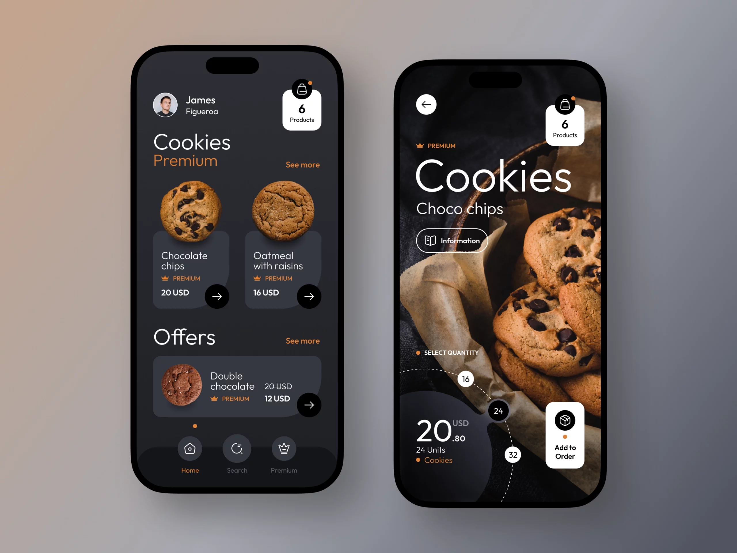
https://dribbble.com/shots/20732975-Cookies-eCommerce-App
https://dribbble.com/shots/20829759-Profile-Information-Popup



2 Comments
Sourav
I found this blog post about the rise of dark mode in UX design really informative and insightful. As a user, I appreciate the option to switch to dark mode for its visual appeal and reduced eye strain. However, it’s crucial that UX designers take into account the accessibility implications of using dark mode and ensure that users with visual impairments or color blindness are not excluded. Overall, this post highlights the importance of balancing aesthetics with accessibility in UX design.
Anonymous
I was excited to uncover this great site. I need to to thank you for your time for this particularly wonderful read!! I definitely enjoyed every part of it and I have you book marked to check out new stuff in your web site.
Comments are closed.